PHARMA Plus Design
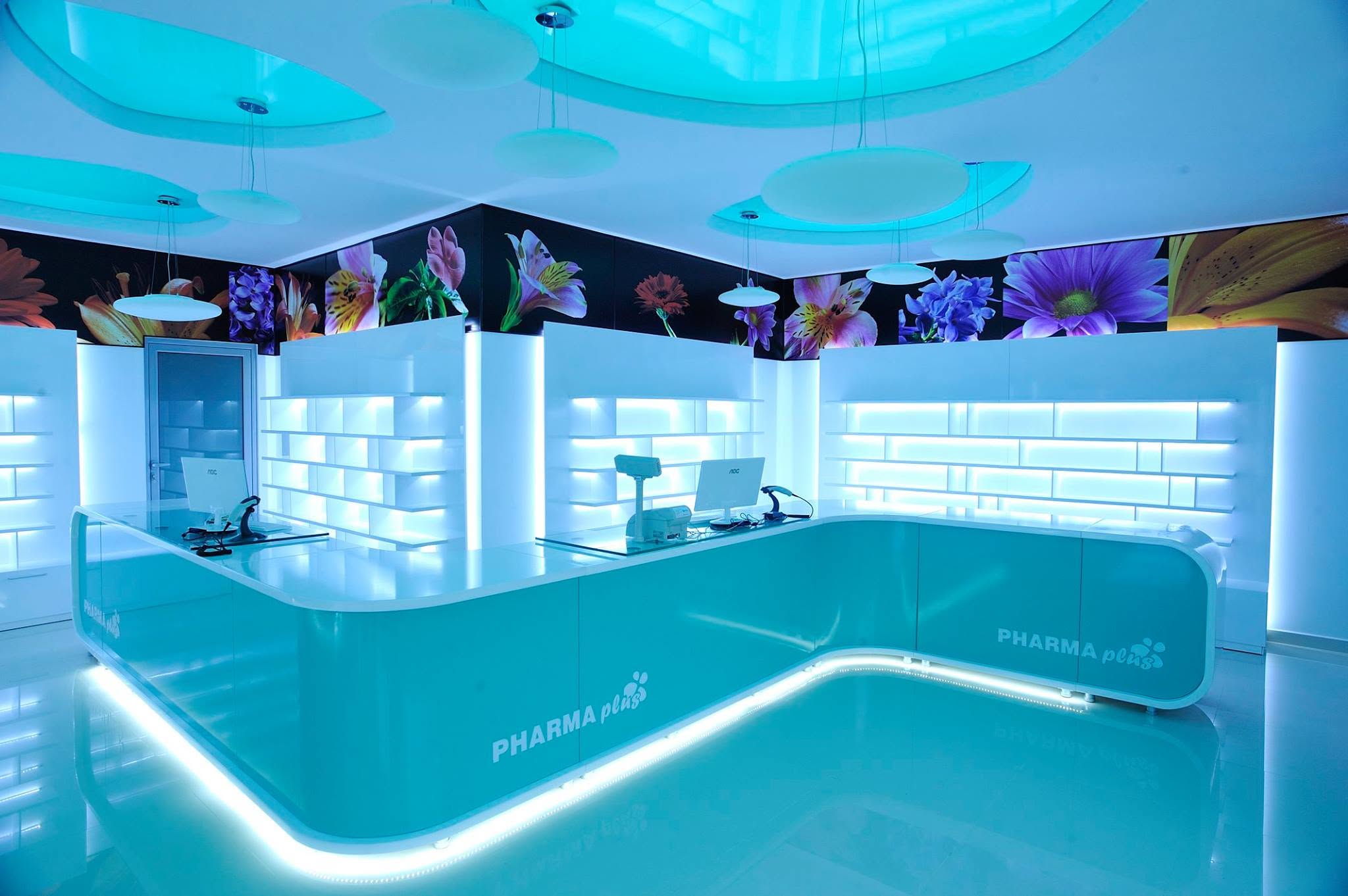
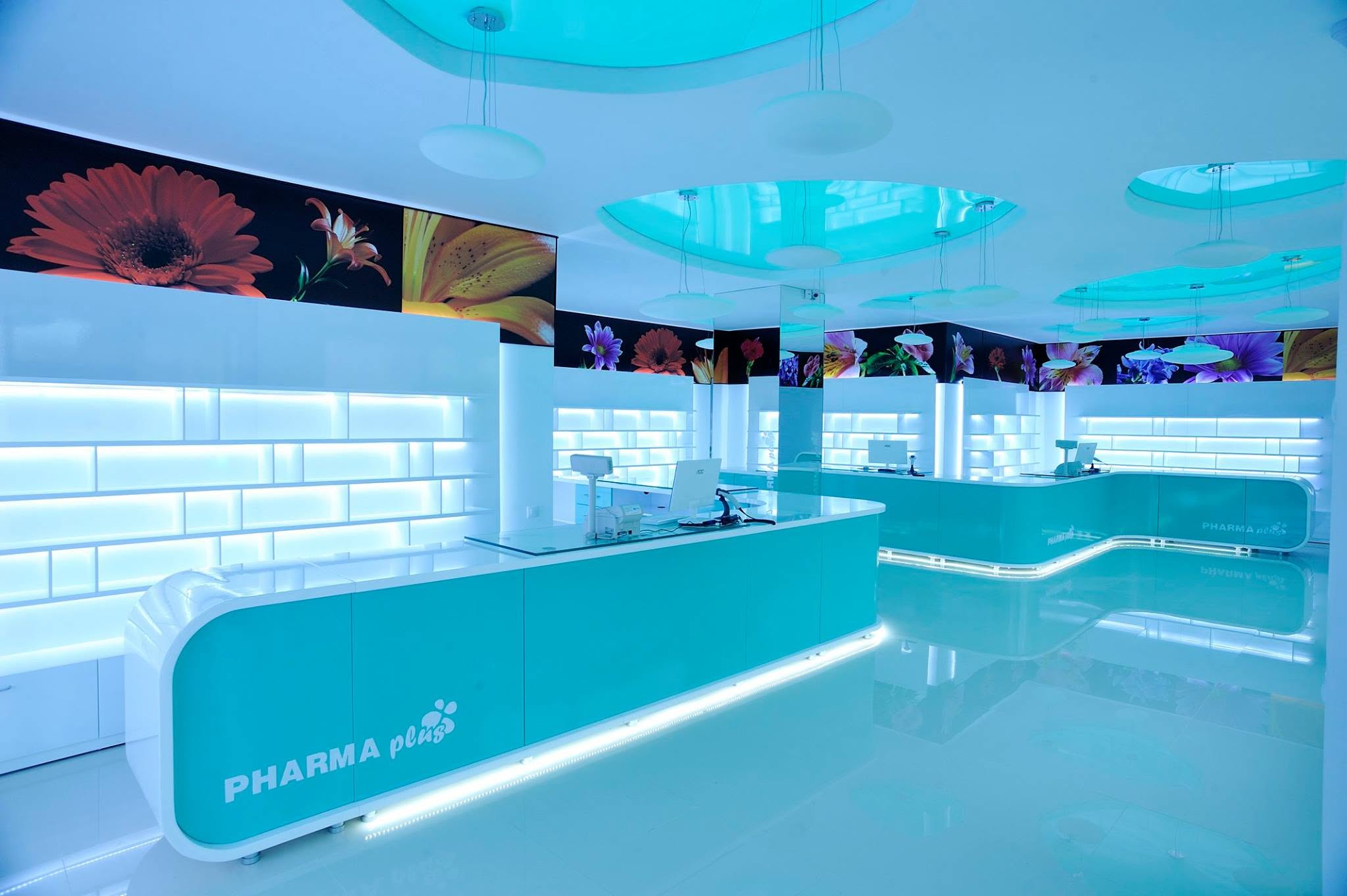
A minimalist pharmacy interior in white and turquoise, tuned for operational clarity, uniform LED-lit display, and clinical precision.
Spatial layout and concept
The interior design for PHARMA Plus proposes a modern space centred on operational efficiency and clarity in public interaction. A minimalist architectural approach is paired with a controlled chromatic palette limited to white and turquoise. A perimeter layout with wide circulation corridors maximises accessibility and visual orientation for customers.
Spatial layout and concept
The interior design for PHARMA Plus proposes a modern space centred on operational efficiency and clarity in public interaction. A minimalist architectural approach is paired with a controlled chromatic palette limited to white and turquoise. A perimeter layout with wide circulation corridors maximises accessibility and visual orientation for customers.
Service area and functionality
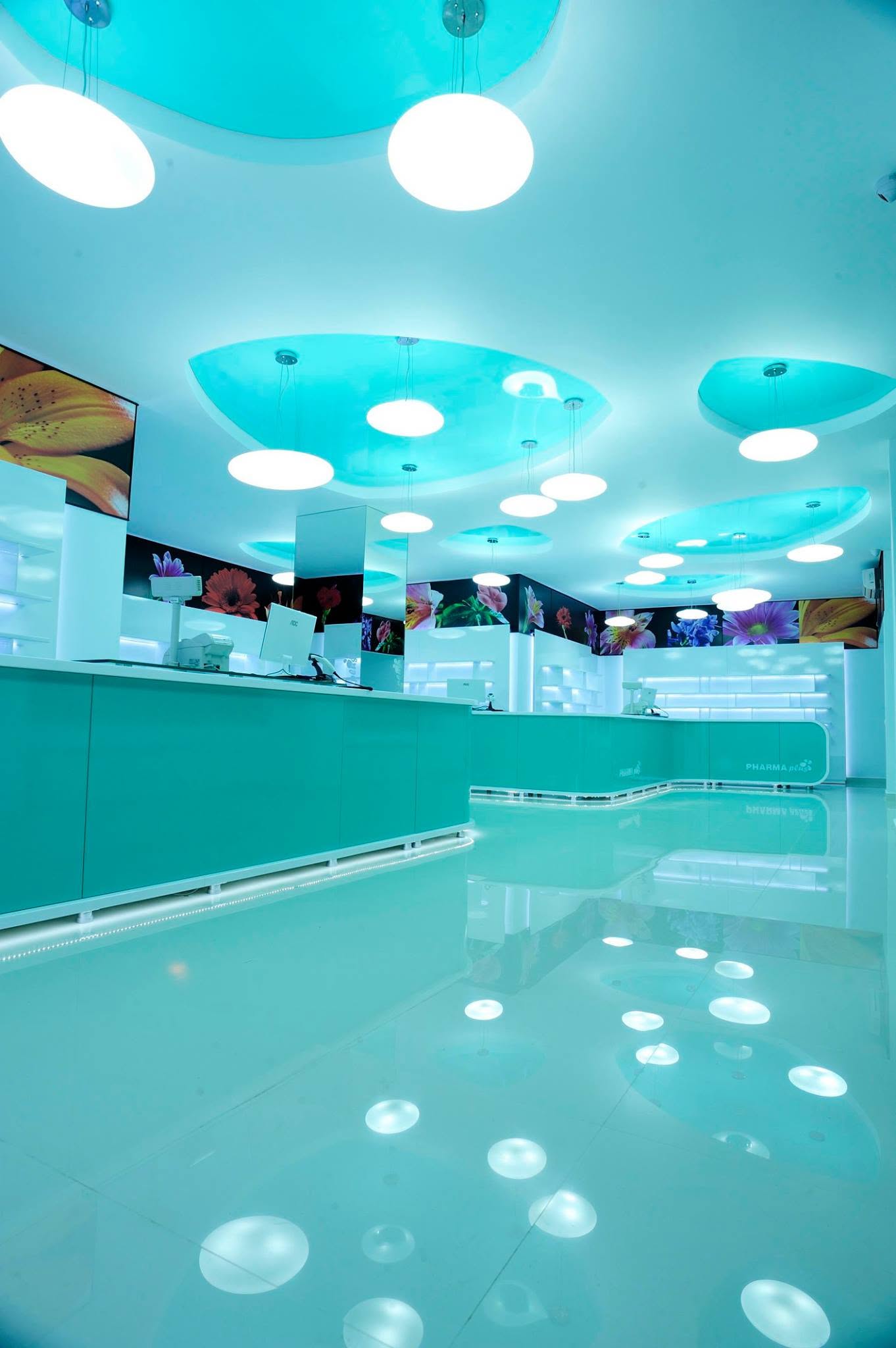
The central L-shaped counter is clad in glossy turquoise panels and grounded by a perimeter strip of white LED lighting, with the PHARMA plus brand mark discreetly integrated into the lower band. Multiple independent sales stations — monitors, keyboards, card readers, fiscal printers — streamline the cashier workflow. A central coordination point delimited by transparent glass partitions supports staff communication and supervision.
Display, lighting and finishes
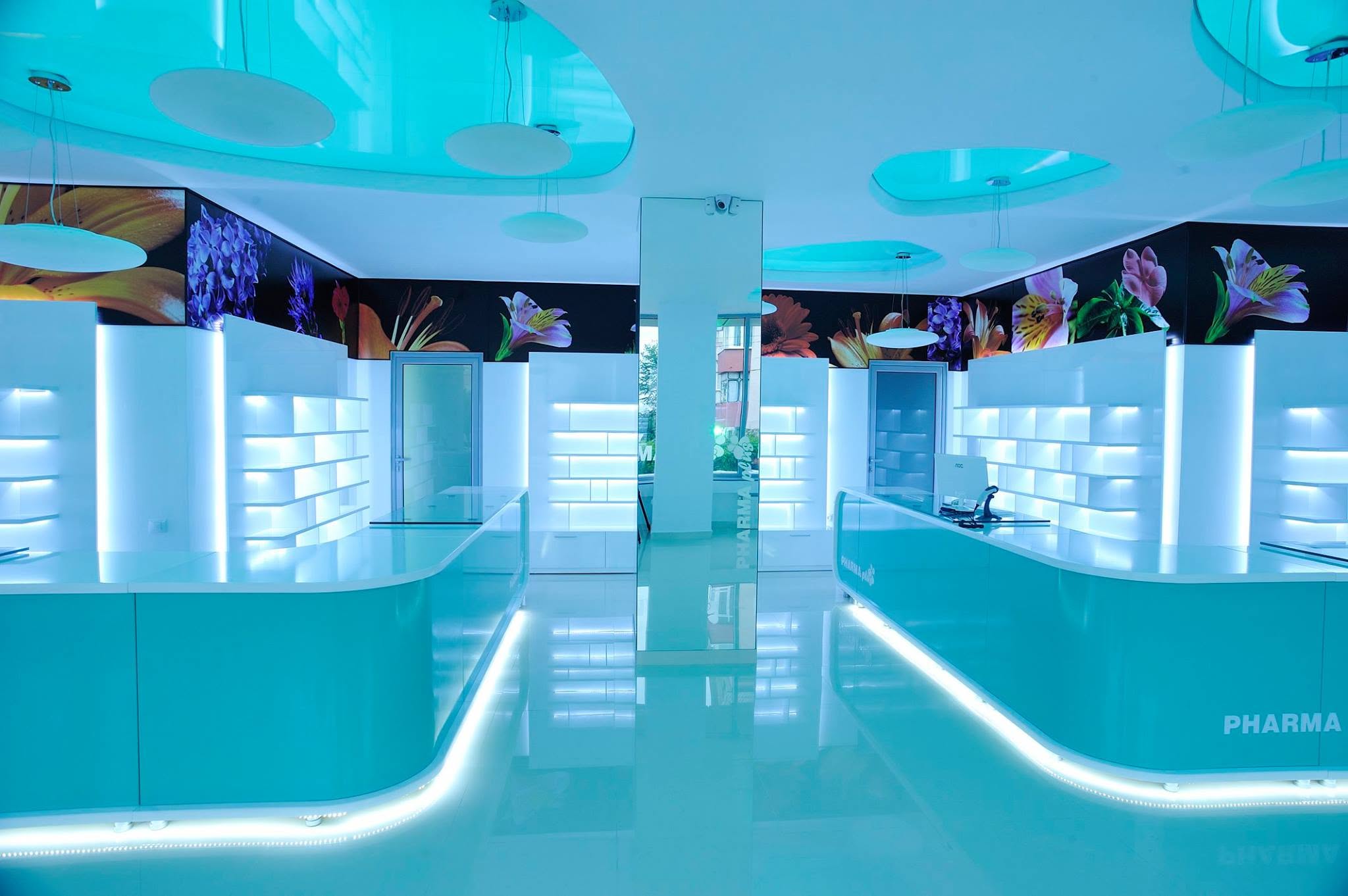
Modular white perimeter shelving with fully LED-backlit background panels ensures uniform, shadow-free presentation of every pharmaceutical category. Above the wall shelves, a continuous graphic band displays macro floral imagery as a controlled visual accent.
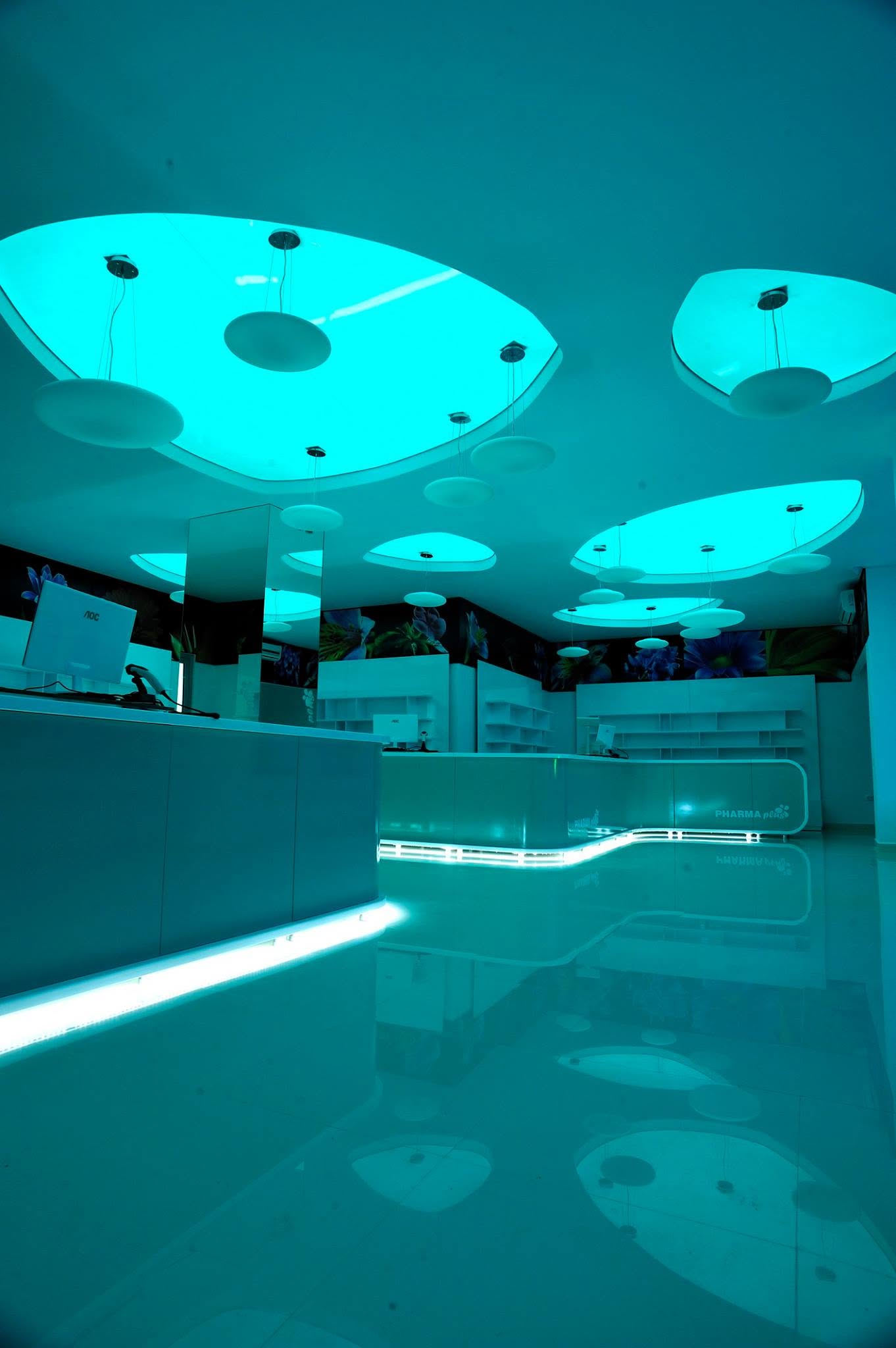
Suspended oval turquoise diffusers, matched by recessed coves, form a coherent atmospheric ceiling. Polished light-coloured flooring reflects the light across the plan, emphasising hygiene, precision and spatial rigour throughout the facility.
Service area and functionality
The central L-shaped counter is clad in glossy turquoise panels and grounded by a perimeter strip of white LED lighting, with the PHARMA plus brand mark discreetly integrated into the lower band. Multiple independent sales stations — monitors, keyboards, card readers, fiscal printers — streamline the cashier workflow. A central coordination point delimited by transparent glass partitions supports staff communication and supervision.
Display, lighting and finishes
Modular white perimeter shelving with fully LED-backlit background panels ensures uniform, shadow-free presentation of every pharmaceutical category. Above the wall shelves, a continuous graphic band displays macro floral imagery as a controlled visual accent.
Suspended oval turquoise diffusers, matched by recessed coves, form a coherent atmospheric ceiling. Polished light-coloured flooring reflects the light across the plan, emphasising hygiene, precision and spatial rigour throughout the facility.
 01
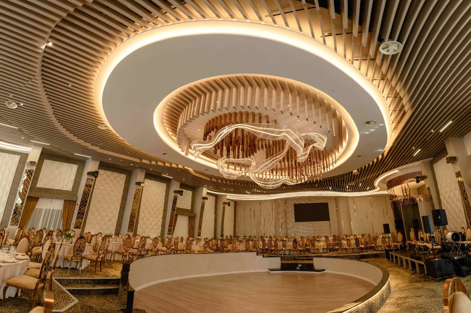
01La Castel — Ballroom
A functional space transformed into an architectural masterpiece — a parametric ceiling, layered light and premium finishes staging every event.
 14
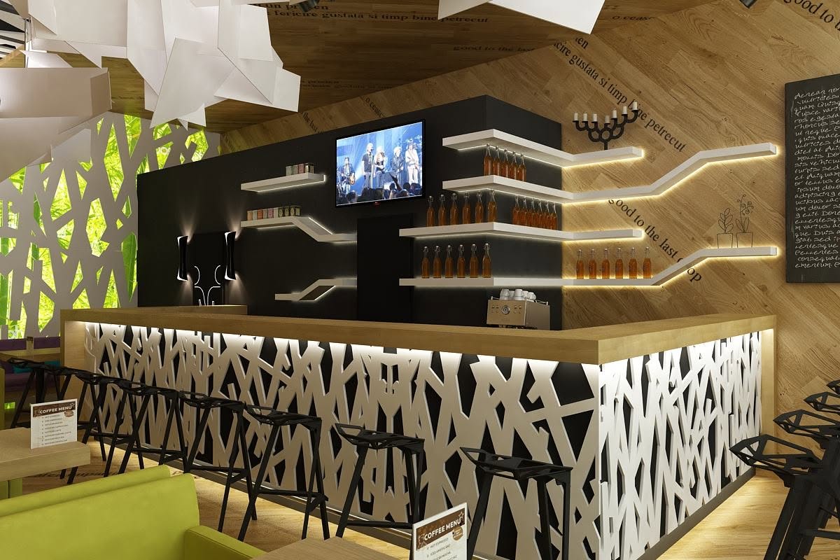
14Parametric Coffee Shop
A concept-driven café where diagonal oak, a backlit parametric bar and sculptural white light-shades meet lime green and deep purple seating.